VB.NET Validation Controls
In this tutorial you will learn about User Input Validation, Required Field Validators, Comparison Validators, Range Validators, Regular Expression Validator, Custom Validators, ErrorProvider, Enabling Controls Based On Input and Other Properties of Validation.
User Input Validation
While any application can be designed with sound logic and good technology and can deliver high performance with accuracy, some errors could still creep into it. This could be due to wrong inputs by users. While the programmer may have taken care of all the exceptions it could cause a loss of business goodwill if a customer is confronted with an error message after he has input data into a number of fields. All of us are familiar with warnings like “Please enter a valid ZIP” or “Please Enter Your First Name!” and so on!
Thus some client side validations ensure that correct data is sent to the application. We can ensure such validations using validation controls. .NET Framework provides several controls for different types of validations.
The validation Controls that are available in .Net Framework are given below:
|
Control |
Description |
| RequiredFieldValidator | Ensures that the user enters data in the associated data-entry control |
| CompareValidator | Uses comparison operators to compare user-entered data to a constant value or the value in another data-entry control |
| RangeValidator | Ensures that the user-entered data is in a range between given lower and upper bounds |
| RegularExpressionValidator | Ensures that the user entered data matches a regular expression pattern |
| CustomValidator | Ensures that the user-entered data passes validation criteria that you set yourself |
Required Field Validators
This is one of the simplest controls to use. This validating control makes
sure that the users have entered data into a data-entry control. For example,
you may want to make sure that users enter their mail id or their credit card
number before they proceed to submit the form. The RequireFieldValidator control
will ensure that the user will not be able to complete the form submission with
null value for the field associated with this control.
The InitialValue property of this control has an initial value set to an empty String (“”) by default. The control raises an error message if this value does not change when validation occurs.
The other controls do not perform validation if the data entry field is empty and make it appear that the validation succeeded when no validation check has been performed. Therefore, it is imperative that a validation check be performed before other checks are activated.
Comparison Validators
This control is used to validate the value entered in to one data entry control by comparing it with the data entered in to another control. The ControlToValidate property sets the field to be validated. The ControlToCompare property specifies the control to compare with. You can also validate the data from constant value by setting the property ValueToCompare. When you set both the ControlToCompare and ValueToCompare then ControlToCompare takes precedence.
The Operator property sets the type of comparison that will be performed.
Table showing the values for Operator property:
|
Value |
Description |
| Equal | Checks if the comared values are equal |
| NotEqual | Checks if the compared values are not equal |
| GreaterThan | Checks for greater than relationship |
| GreaterThanEqual | Checks for greater than or equal relationship |
| LessThan | Checks for Less than relationship |
| LessThanEqual | Checks for less than or equal relationship |
| DataTypeCheck | Compares the data types between the value entered into the data-entry control that is validated and the data type specified by the Type property |
The type property can have any of the following values:
- String
- Integer
- Double
- Date
- Currency
Range Validators
A range validator test is used to check if the value entered in the
data-entry control is within a specified range of values. The property
ControlToValidate is set to the control that contains the data which is to be
validated. The property MinimumValue sets the minimum value of the range. The
property MaximumValue sets the maximum value of the range. The property Type
sets the date type of the values to be compared. All the types of comparisons
discussed above are still valid for this also.
Regular Expression Validator
RegularExpressionValidator control is used to check if the value in a
data-entry control matches a pattern defined by a regular expression. You can
check even the format of the text entered. Regular expressions are generally
made up of test with embedded codes that start with a backslash (). For
instance a simple expression for checking for either a uppercase or lower case
alphabet is given by the expression “ b[A-ZA-z]+b.
Custom Validators
This control allows the developer freedom to define his own validations. The
property ClientValidationFunction property sets the name of function or script
that will do the validation. This function takes two parameters. The first
argument source identifies the source control to validate. The second argument
arguments hold the data to validate.
The Causes Validation Property
CausesValidation is one of the public instance properties of the control class, which specifies whether all controls which require validation gets it when the control gets focus. It returns true if the control causes validation to be performed on any controls requiring validation when it receives focus and false otherwise.
Validating event occurs when the control is validating at the time when the control loses the focus if the control’s CausesValidation property is true. Any code executed in response to this event can be used to throw exception if any is found. Validated Event occurs when the control has completed validation. This event occurs if no exception was thrown in the validating event. Clearing up the error provider messages can be done here.
{mospagebreak}
Error Provider
The Windows Forms ErrorProvider component is used to validate user input on a form or control. It is typically used in conjunction with validating user input on a form, or displaying errors within a dataset. An error provider is a better alternative than displaying an error message in a message box, because once a message box is dismissed, the error message is no longer visible.
The System.Windows.Forms.ErrorProvider component displays an error icon ( ) next to the relevant control, such as a text box; when the user positions the mouse pointer over the error icon, a ToolTip appears, showing the error message string.
Let us see an example for CausesValidation and also ErrorProvider in the following illustration:
- Create a new project in the Visual Studio IDE and
- Add two text boxes to the Form1.
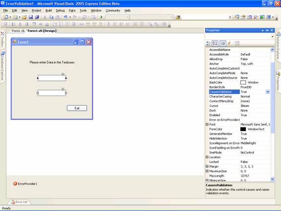
- Check to see if the default value of the causes validation is set to true. This means that when the either text box receives the focus, it will cause all the other controls validating events to occur.
- Add an error provider object from the toolbox. You will see the window like the one in the screenshot below:
-
Now add the following code
Click here for Sample Code
-
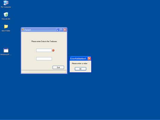
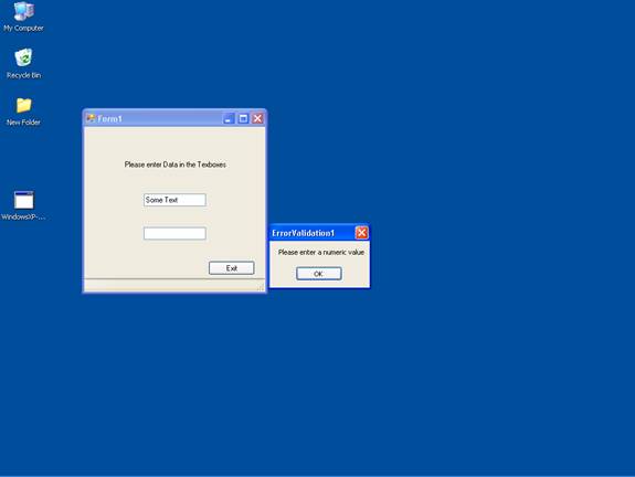
Now press F5 to execute the application. The following three screenshots will show the output and the error messages.
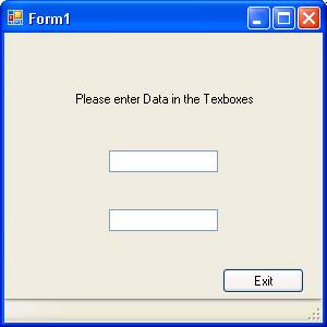
The following screenshot shows the message box shown by the exception handler in response to the event validating when no data entered in the text box:
The following screenshot shows the message box displayed by the exception handler in response to the EventValidating when text data is entered in the text box.
The following screenshot shows the message box displayed by the exception handler in response to the EventValidating when text data is entered in the text box.
{mospagebreak}
Enabling Controls Based on Input
One of the limitations of computer usage is the limitation of area that can be viewed at a given point in time. This puts the stress on visually arranging the various controls on the surface area of the screen. This disadvantage is further enhanced if the data entry in one control is incumbent upon data entry to be made in another control. One solution that is offered for overcoming this limitation is the enabling of the visible properties of the control in the event handling code wherein decision making information is being captured.
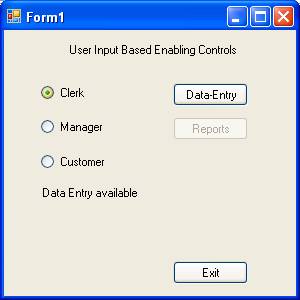
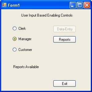
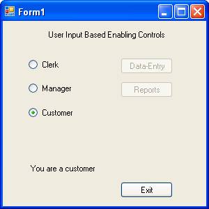
Let us examine a situation where a user is trying to access some information in an application. Only data entry screen is allowed for clerks and reports alone can be accessed by the mangers. If you are neither a manager nor a clerk you cannot proceed further.
In a new project, add three radio buttons and four buttons and arrange them as in the following picture:
Add the following codes:
Now press F5 to execute the program. The following three screenshots show the three states of the program.
Other properties for Validation
The CharacterCasing Property
This is a property of control. It can have one of the following three values:
1. Lower auto converts all the values to lower case
2. Upper auto converts all the values to upper case
3. Normal takes the value as typed by the user.
The MaxLength Property
You can use MaxLength property to set or get the maximum number of characters allowed in the text box. You can use RequiredFieldValidator and RangeValidator to validate this property. The following code snippet shows the method of validation:
In this lesson we have looked at Exceptions and type of Exception handling routines that are available in VB.NET. In the next lesson we shall be talking of the process of Creating and Managing Components and .NET Assembly.
[catlist id=175].
