Creating and Managing Components Part 2
In Section 2 of Creating and Managing Components You will learn about Hosting a control inside Internet Explorer, HTMLAnchor Control, HTMLButton Control, HTMLGeneric Control, Creating Components by extending the Control class, Creating a custom control and Creating components by extending the Component class.
Hosting a control inside Internet Explorer
ASP .NET server controls are group of new controls provided by .NET. They are of different kinds. HTML Server controls, Web Server controls and Validation controls are the other types. These controls derive from System.Object -> System.Web.UI.Control -. HtmlControl.
.
.
.
.
.
.
Some of the controls are listed below:
| Control | Related HTML Tag |
|
HtmlAnchor |
Allows access to program against the < a > tag |
| HTMLButton | Allows access to program against the< button > tag |
|
HTMLForm |
Allows access to program against the < form > tag |
| HTMLGeneric | Allows access to HTML tags that are not represented by any HTML server control specifically |
|
HTMLImage |
Allows access to program against the < img > tag |
These controls are hosted in the browser by using codes which are discussed below:
HTMLAnchor Control
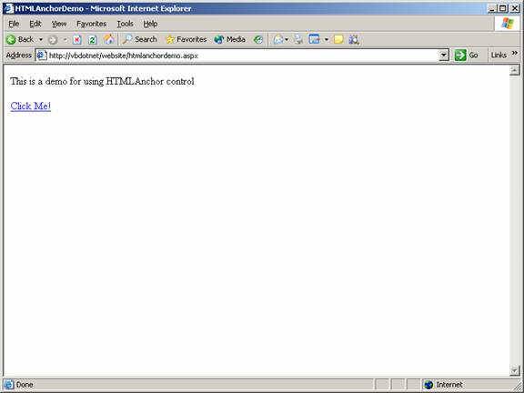
This control allows access to program the HTML tag. An example is shown below:
Aspx file code:
Code behind page code:
You can now see the control hosted in the browser:
HTMLButton Control
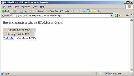
HTMLButton Control allows the user program the HTMLtag. This is the tag used to place clickable buttons within HTML documents. This is achieved by the following code:
The code that is written in the aspx page:
The code that is written in the code behind page:
The page when viewed in a browser looks like the screenshot below:
HTMLGeneric Control
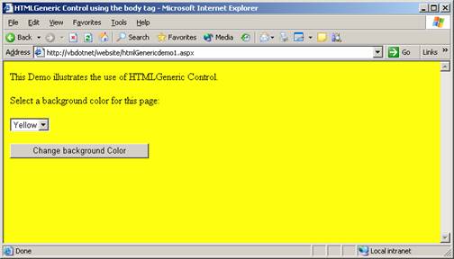
HTMLGeneric control allows the user program the HTML tags that are not represented by any of the specified controls. Some of the examples are < span >, < div >, < body > and so on. The following demo illustrates the use of HTMLGeneric Control to access the HTML tag.
The codes that are given in the aspx page are given below:
The codes that are given in the code behind page are given below:
The view of the page in the browser is shown below:
Creating Components by extending the Control class
Components can be created by extending a control class. This feature enables the application developer in numerous ways. He can create customized components for his application using the basic functionality of the component as his starting point.
To start with, a library of derived controls can be created out of predefined controls. These controls can then be customized by adding specific functionalities. The features of the base class can also be extended by adding few properties that are essential to the application being developed.
Creating a custom control
1. Create a new control library project in the visual studio.
2. Right-click on the solution explorer and add a new custom control.
You will see a screen like the one you see below:
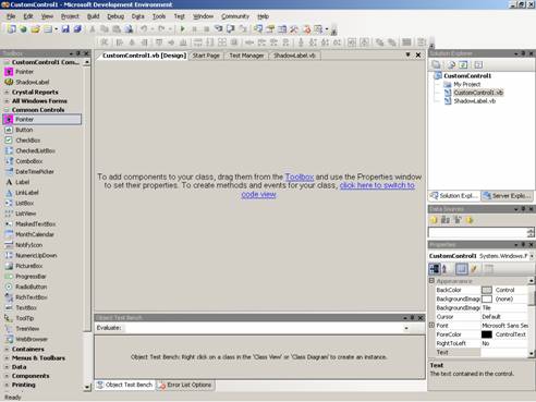
Controls can be dragged and dropped for customization. For the purposes of study, let us drag and drop a label control. The codes for this control will be displayed in the code window. Now add the following code to the class:
{mospagebreak}
.
.
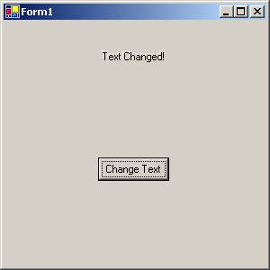
We have now added one property called ShadowColor and also have overridden the onTextChanged and onPaint methods.
Now we shall create a windows project in the Visual Studio. Right-click on the ToolBox to and click on “Choose Items ..”. A new dialog box to add control is shown. Navigate to the custom control that we have created and add the control. The control will be displayed in the ToolBox. We can now drag and drop this control on the Form. Now click F5 to see the result. The onTextChanged method and onPaint event which have been overridden have caused the visual effect to happen as shown by the screenshot below:
.
..
Creating components by extending the Component class
Component classes are inherited from System.ComponentModel.Component. By inheriting from this class, the application developer is provided with a good designer surface, like that of Forms designer. This designer is called component designer. Controls can be dragged and dropped on to this designer from the tools box.
This helps the developer build quicker and easier solutions. Server controls can be added rapidly to the solution. Let us now take a look how easily this can be done.
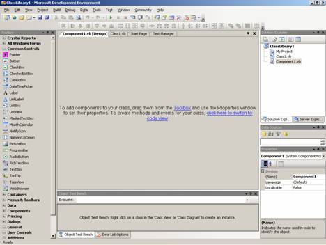
The application developer can Drag and drop any component to the class from the ToolBox and extend the facility or he can open the code view and author a new component altogether.
Click on the code view. Now add the following lines of code to the class:
The instance initialization parameters are shown in the member variables. Only InstanceID is declared as public.
One property is defined to return the value of ClassInstanceCount. The Finalize method is overridden to decrement the value of ClassInstanceCount. Now the developer can build the solution to make it available for the being consumed. This can be imported to the toolbox and used by dragging and dropping.
To consume this component, create a windows application project in visual studio. Add reference to the component’s namespace. Add a button control and a timer component to the form. Enter the following code to the Form1.
Click here for Sample Code
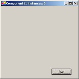
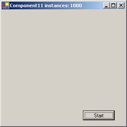
In this example we are entering code to the timer’s Tick Event handler that shows the instance count as the forms caption. We are also adding the codes to the button’s click Event handler that instantiates the component 1000 times. Now we locate the sub new and add the following code to start the timer immediately after initialization of the component.
Now press F 5 to execute the program. The output is shown below:
|
The Screen shot at start up showing the instance number |
The screen shot after pressing the button |
|
|
|
[catlist id=175].

